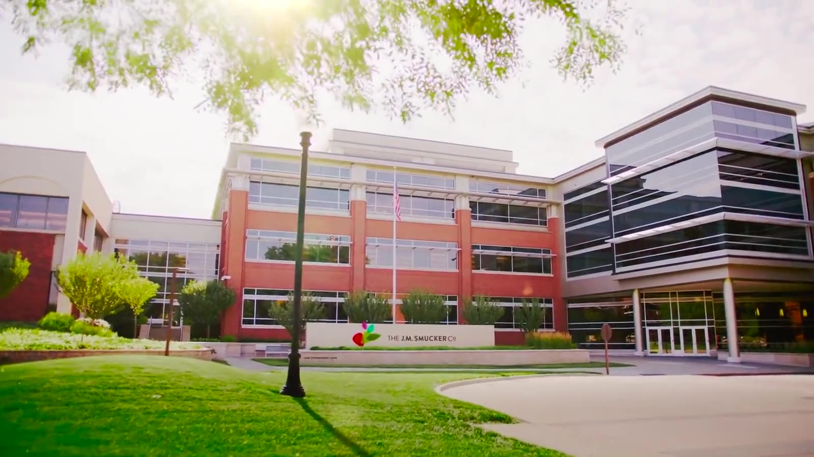
The J.M. Smucker Co.
Most people still knew Smucker's for jam. The corporate communications team needed jmsmucker.com to tell the bigger story: a Fortune 500 family company behind more than 40 coffee, consumer food and pet food brands, a place to build a career in Orrville, Ohio, and a stock worth a main-street investor's attention.
Overview
From a jam company to a house of brands, without losing the family at the table.
The J.M. Smucker Company had grown through acquisition into a multi-billion-dollar business: Folgers, Dunkin', Café Bustelo and 1850 in coffee; Jif, Smucker's, Crisco and Sahale Snacks in consumer foods; Milk-Bone, Meow Mix and Rachael Ray Nutrish in pet. The corporate site still read like the jam company, and it served none of the audiences the communications team cared about well.
Three of them mattered most. Consumers and media who needed to see the breadth of the portfolio. Candidates who needed to feel what it is like to work at the Orrville headquarters, inside a culture five generations of one family had shaped. And main-street investors who wanted the numbers, the filings and the story in plain language.
With Fahlgren Mortine I led creative direction, UX architecture and design from wireframes through detail design for the 2019 launch. When Smucker rebranded in 2021 with a new mark, palette and typography, I returned to carry the site through the change without rebuilding it.
Our objectives
-
01.Transform the corporate story from jams and jellies to the 40-plus brands, three categories and billions in sales the company represents today.
-
02.Make the site a recruiting tool for the Orrville headquarters: show the campus, the people and the family-style culture, not just the job listings.
-
03.Serve main-street investors with live stock data, results, filings and plain-English financial highlights alongside the story.
-
04.Give corporate communications one home for news, stories, publications and the impact report, with a social feed that keeps it alive between releases.
-
05.Build it as a component system that could take a brand change, which it had to two years later.
More than jams and jellies






Made for Families
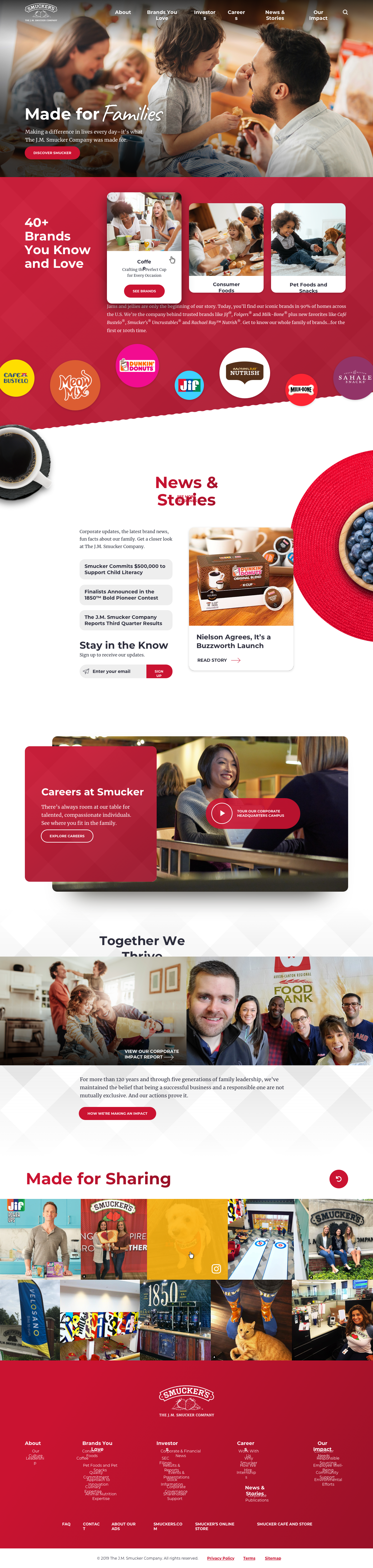
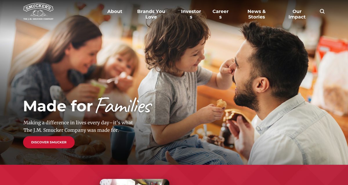
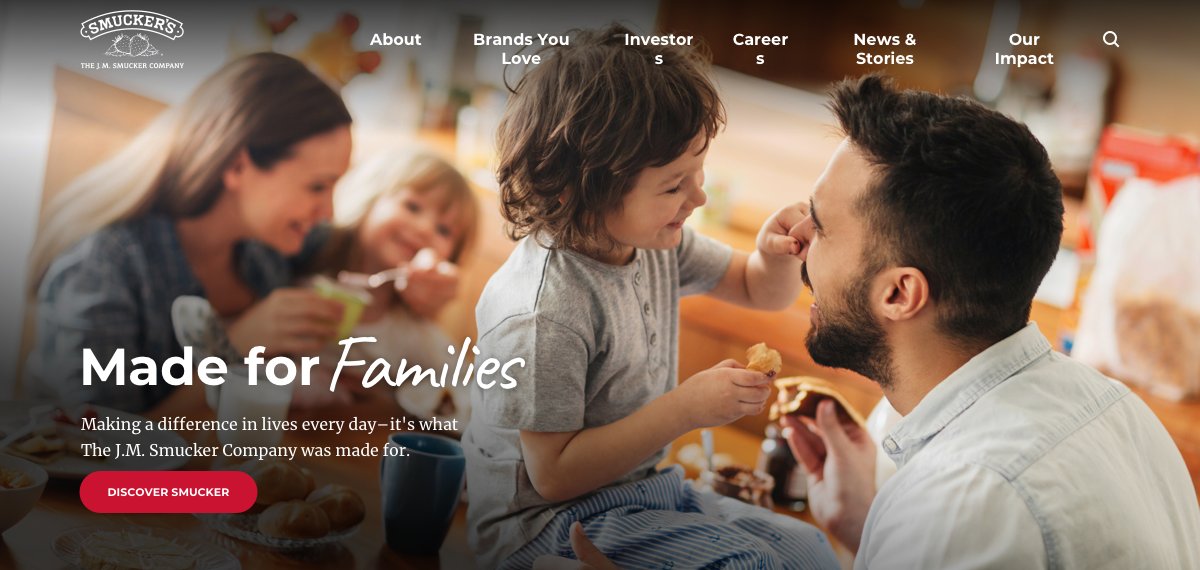
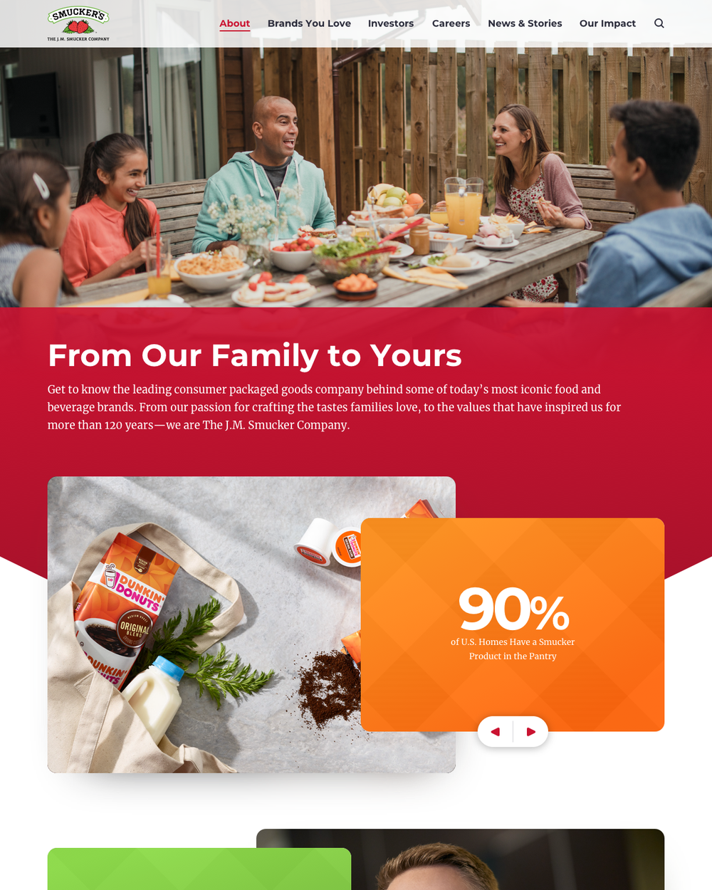
The home page opens on people, not products: a family at breakfast under a hand-lettered "Made for Families", one of four hero directions. Below it, "40+ Brands You Know and Love" puts the whole portfolio on one red gingham band, then News & Stories, a Careers film, the impact story and a "Made for Sharing" social grid.
Brands You Love
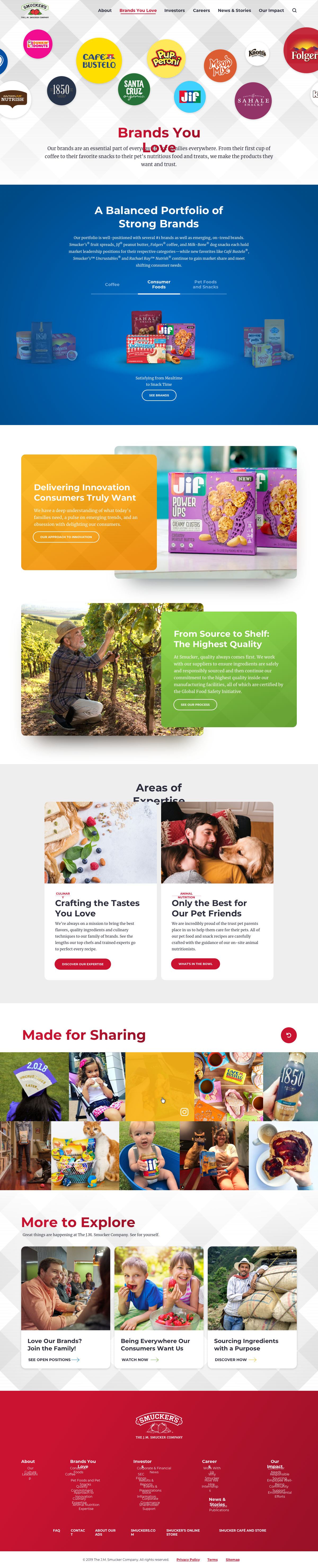
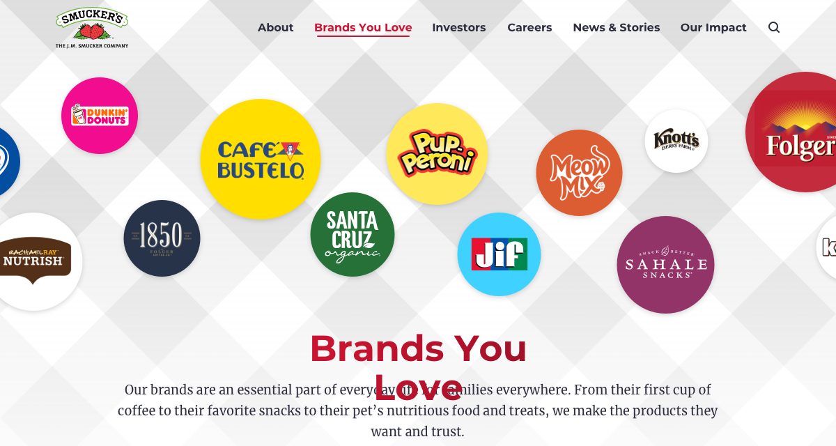
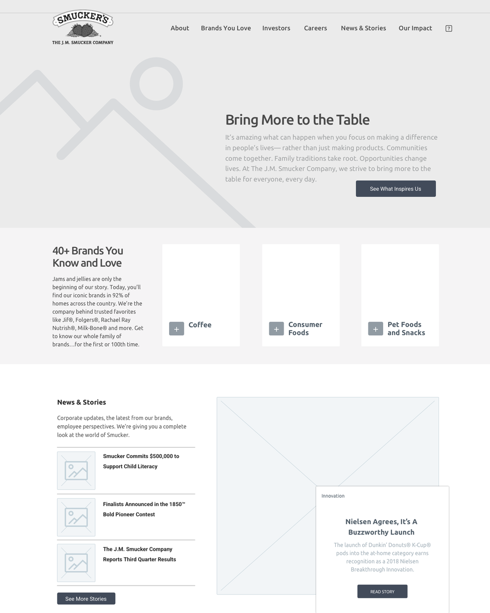
A wall of brand marks leads into a balanced portfolio: Coffee, Consumer Foods, and Pet Foods and Snacks as tabs over the products themselves, then innovation, quality and the two areas of expertise, culinary and animal nutrition. This is the page that changes what "Smucker's" means.
Create a career with us
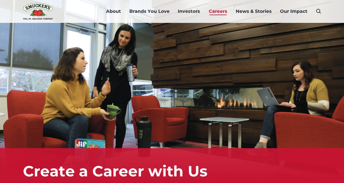
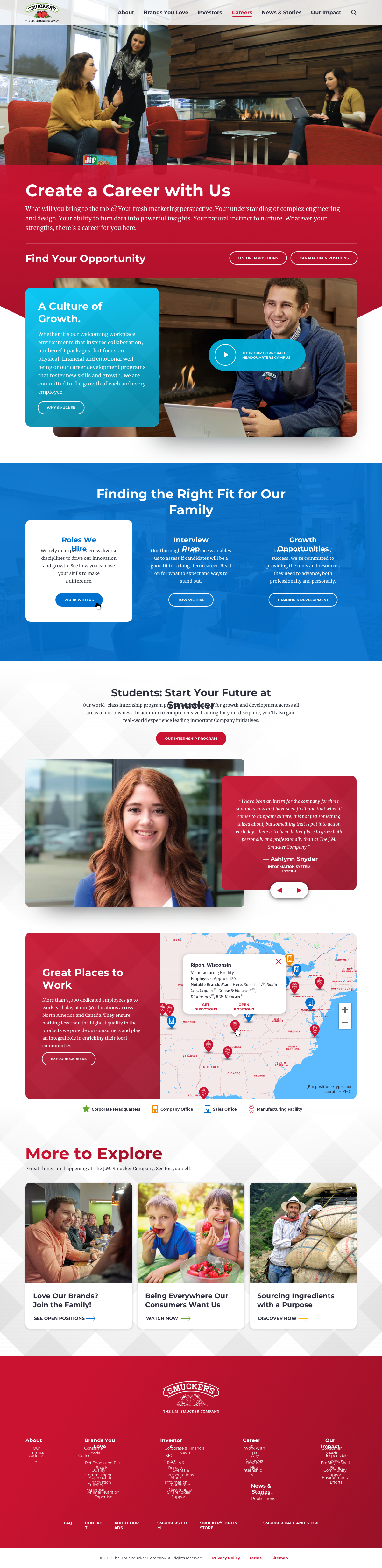
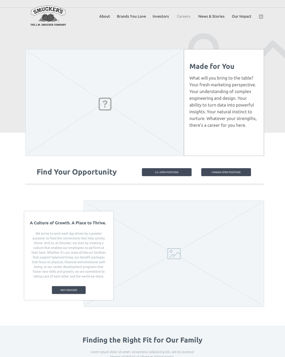
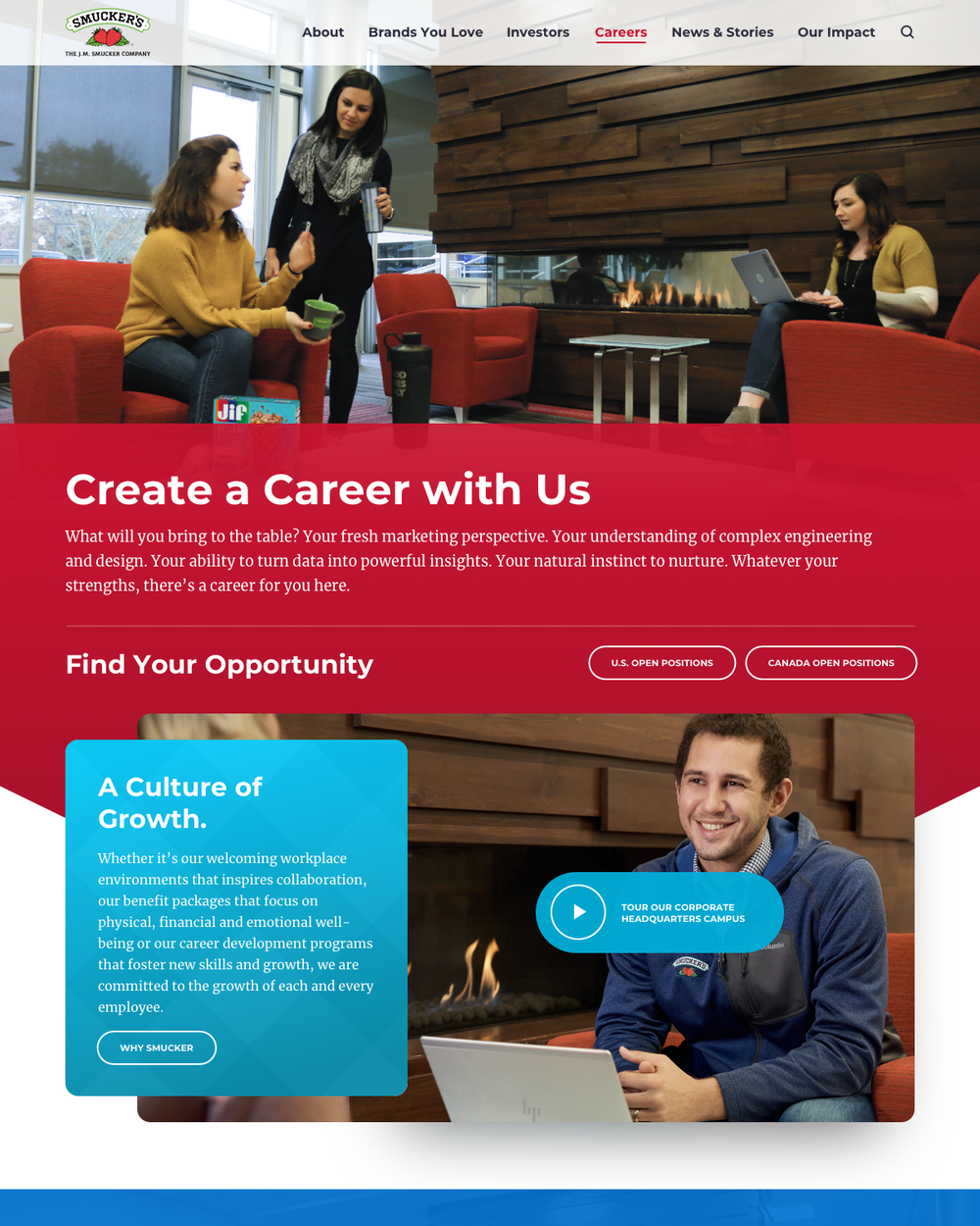
Careers is built to recruit for Orrville. A campus tour film, "A Culture of Growth", the hiring process in three steps, an intern's testimonial and an interactive map of thirty-plus locations, with the corporate headquarters marked with a star.
Investors, in plain English
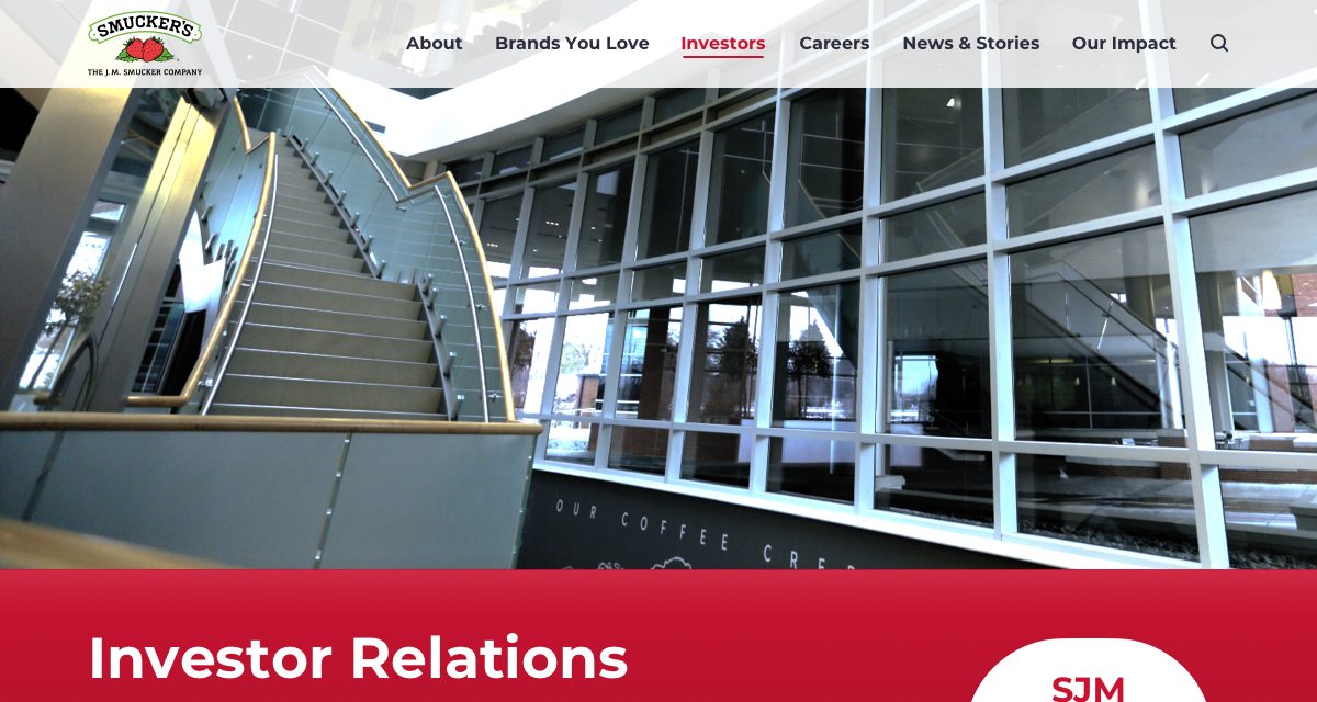
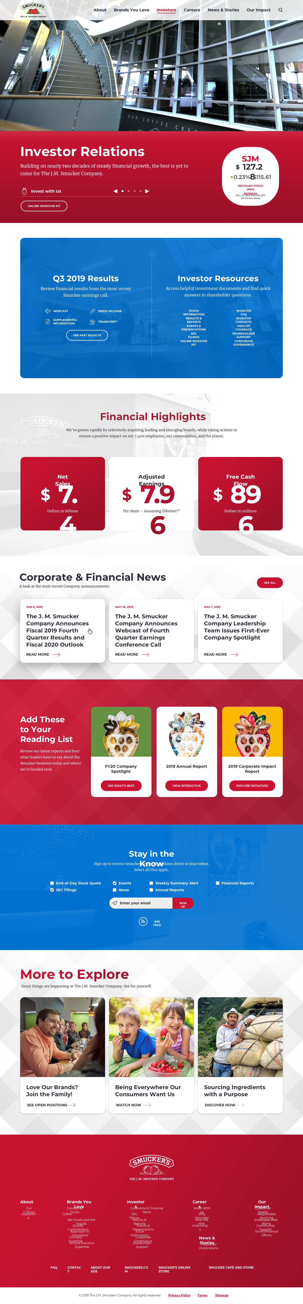
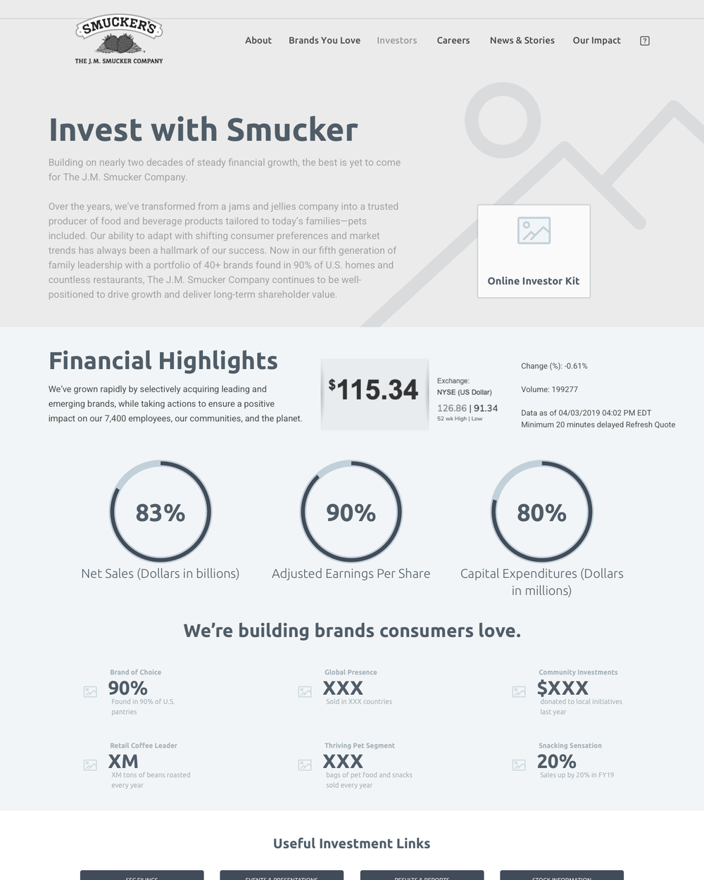
A live SJM quote sits in the hero. Quarterly results and investor resources share one blue module, financial highlights are three big numbers, and the reading list packages the company spotlight, annual report and impact report for people who don't read 10-Ks for a living.
The Smucker Way
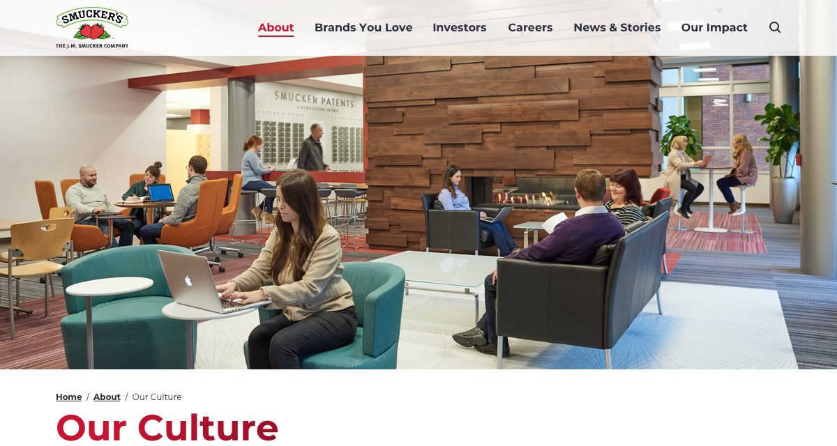
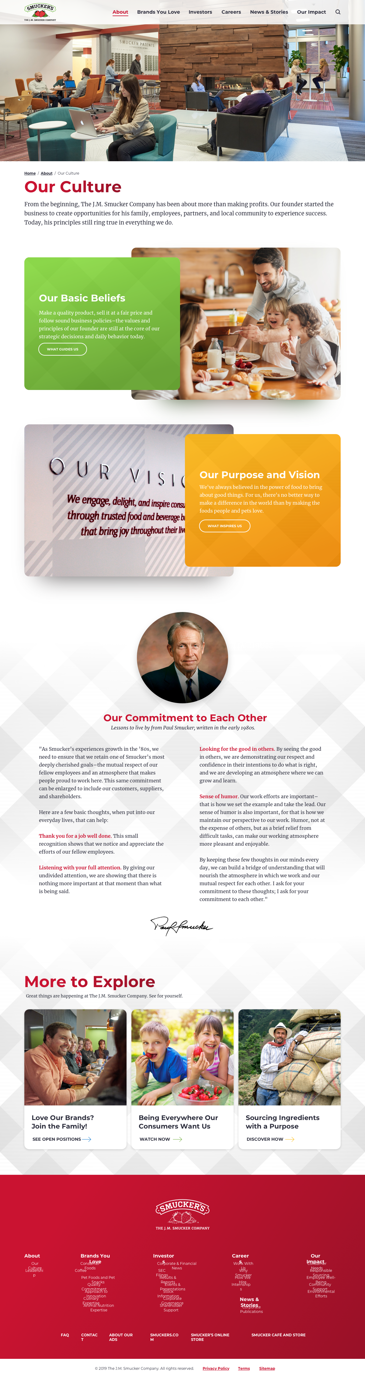
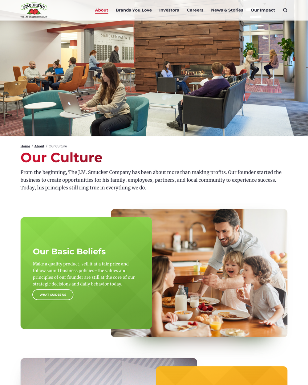
Purpose, vision and the Basic Beliefs the family has run the company on since 1897, told with the leadership team, the Orrville offices and a timeline of defining moments. The culture pages are what make the careers pages credible.
Thriving together
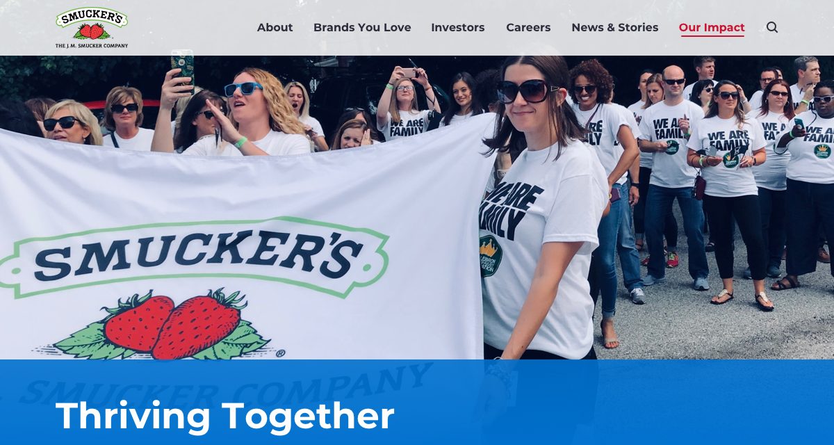
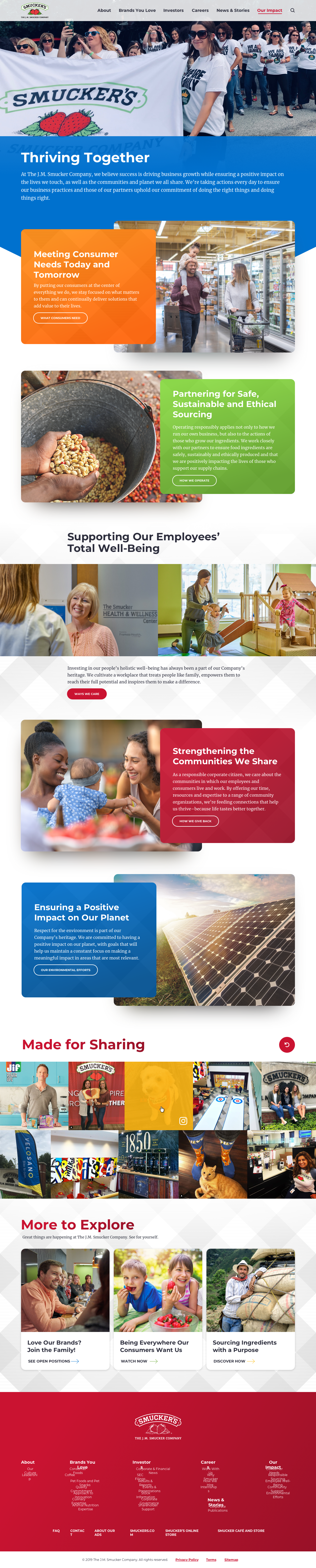
Our Impact organises corporate responsibility around consumers, responsible sourcing, employee well-being, communities and the planet, each as a colour-blocked card that links to its own page, and closes on the Made for Sharing feed.
Wireframes & direction
Structure first, then the warmth
The sitemap settled on six sections that map to the audiences: About, Brands You Love, Investors, Careers, News & Stories and Our Impact. Wireframes in spring 2019 locked every page type and the component kit before a colour was chosen, so the storytelling modules, the location map, the stock ticker and the social feed all had a home.
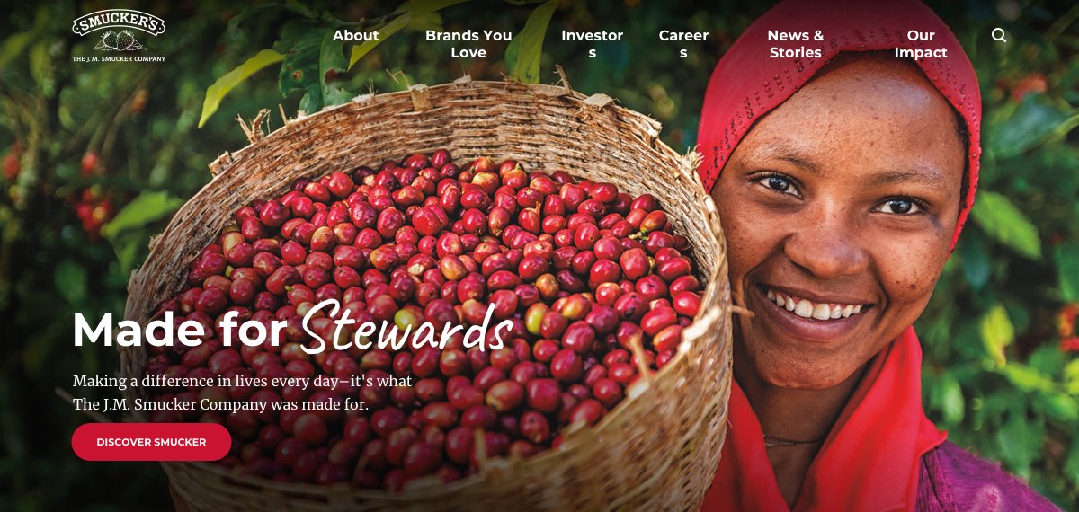
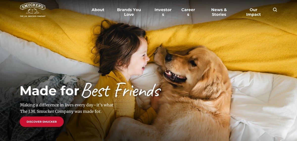
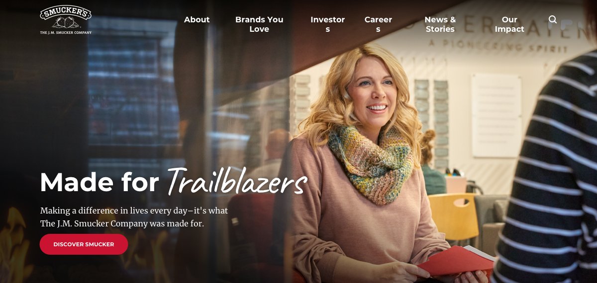
Detail design then leaned into what Smucker already owned: the red gingham as a diamond texture, brand marks as a family of circles, warm photography of real associates, and a hand-lettered script to make "Made for Families", "Stewards", "Best Friends" and "Trailblazers" feel written rather than set.
For more than 120 years and through five generations of family leadership, we've maintained the belief that being a successful business and a responsible one are not mutually exclusive. And our actions prove it.— "Together We Thrive", jmsmucker.com
Careers & culture
Recruiting for Orrville with film, not job boards
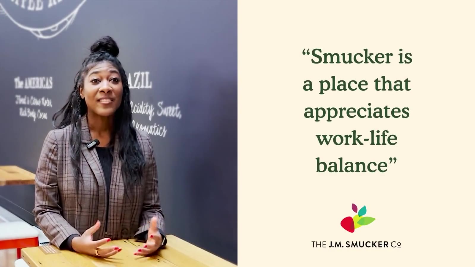
Smucker's competition for talent is not other food companies, it is the idea that a career means a coast. So the careers and culture pages lead with the campus at One Strawberry Lane and the people in it: a headquarters tour, associate stories on work-life balance and family-friendly benefits, the childcare centre, the wellness centre, the Basic Beliefs.
Every film has a home in the system: the hero tour on Careers, story films inside the Why Smucker and Employee Benefits pages, and a "Love our brands? Join the family" tout that follows readers through the rest of the site.

Corporate rebrand · 2021
A new company mark, carried by the same architecture
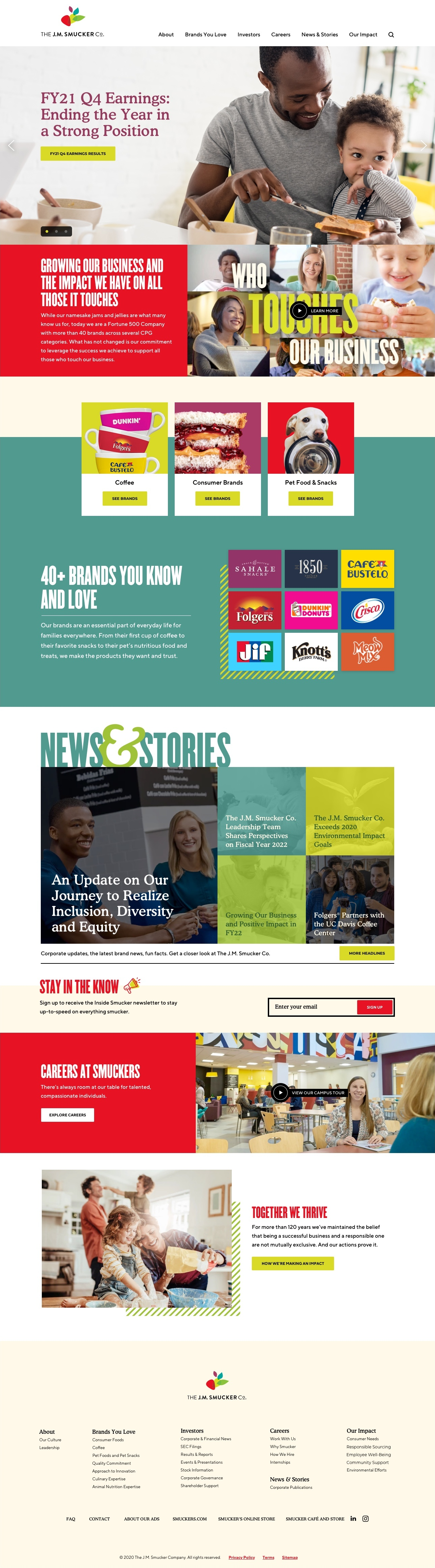
In 2021 The J.M. Smucker Co. retired the strawberry-and-banner corporate logo for a new fruit-and-leaf mark and a bolder identity: cream, red, bold purple, trusted green and a bright idea green, headlines in condensed Champion with Cooper for accents, TT Norms for everything else, and a family of strawberry, leaf and stripe patterns.
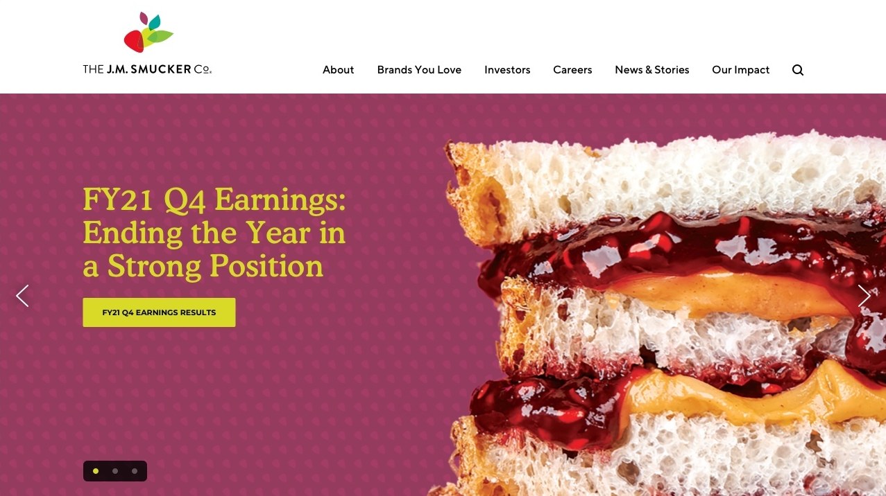
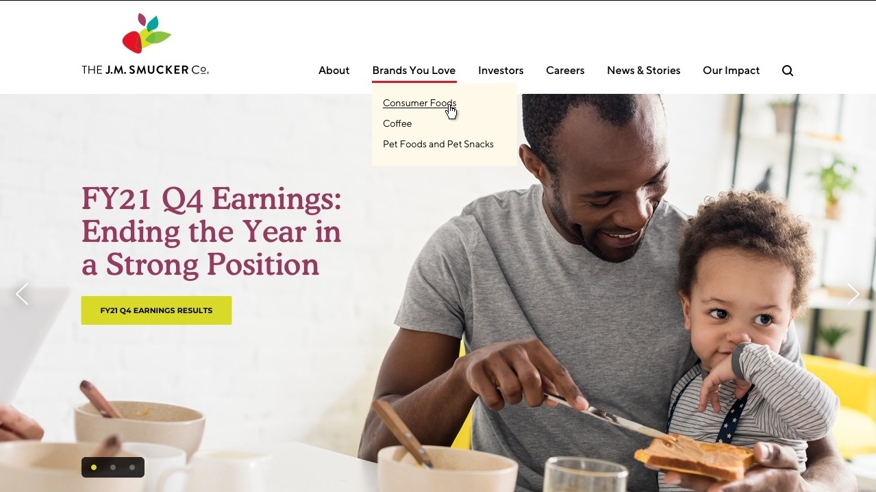
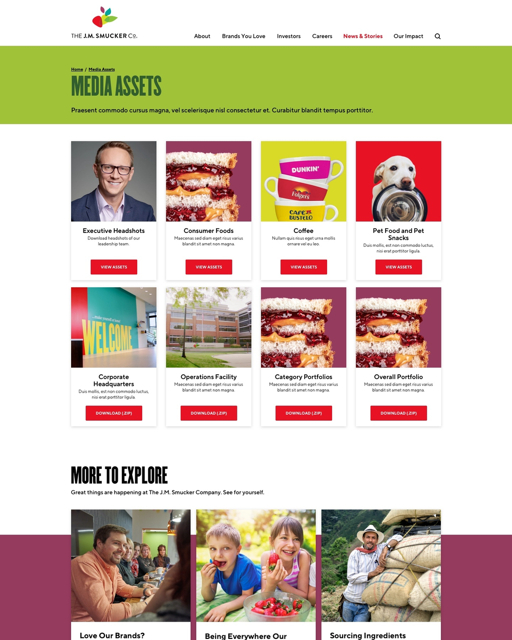
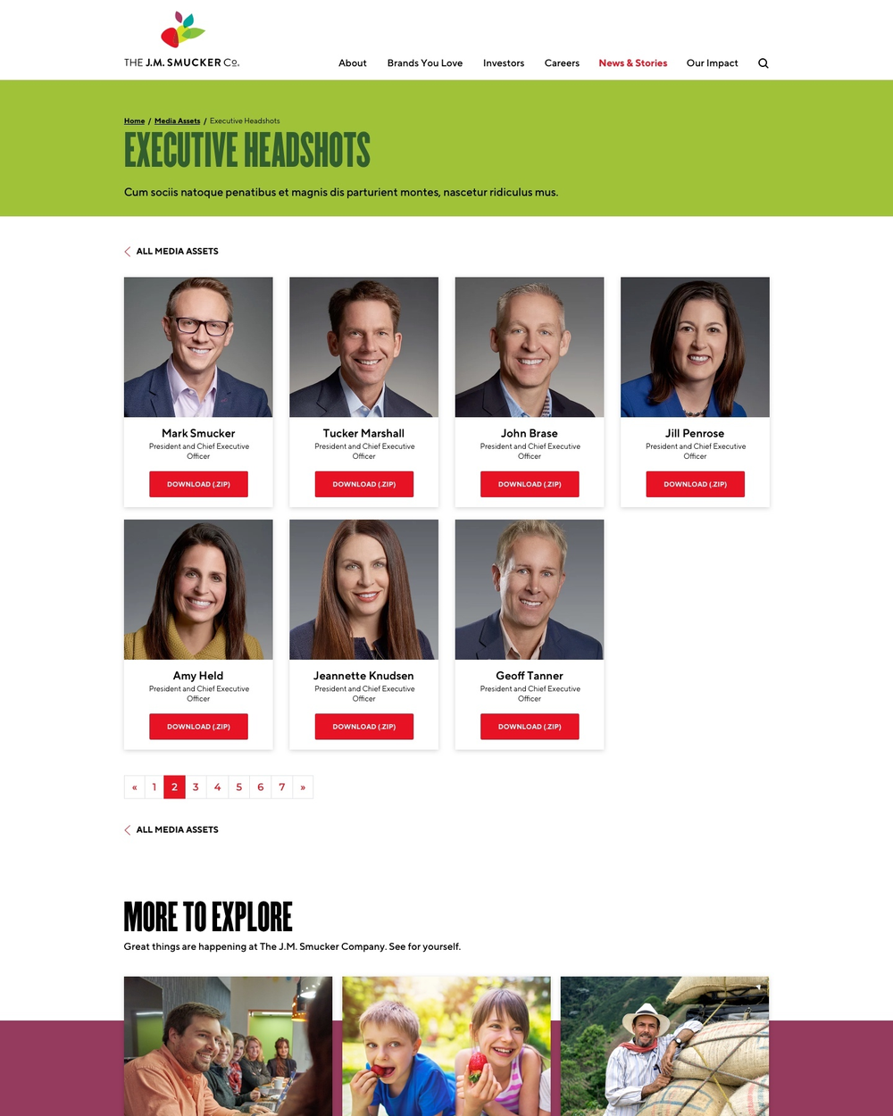
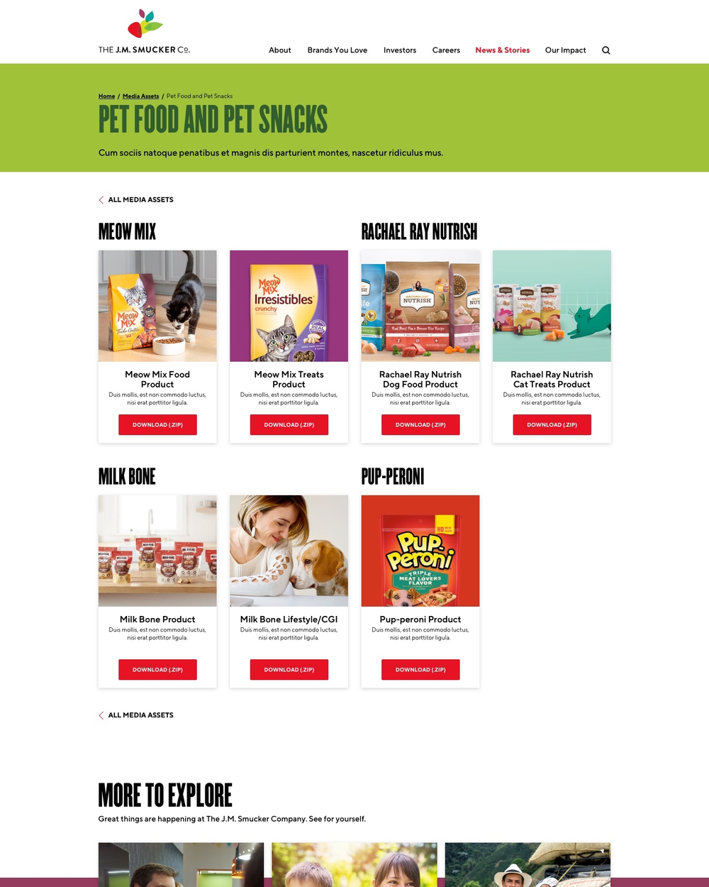
Because the 2019 site was built as a component system, the rebrand was a reskin rather than a redesign. The home page got a new hero carousel with three colourways, "Who Touches Our Business" and "40+ Brands" as colour-blocked bands, a refreshed News & Stories, and a new Media Assets section with downloadable headshots, product photography and brand portfolios for the press.
The impact
A corporate site that finally matched the size of the company
jmsmucker.com launched in 2019 as the company's story for consumers, candidates and investors in one place, and it held its structure through the 2021 rebrand with only a visual layer changed. The architecture, the component kit and the film-first approach to culture are still recognisable on the live site today.
Brands in one story
Coffee, consumer foods and pet, from Folgers and Jif to Milk-Bone and Meow Mix.
Locations on the map
Headquarters, offices and manufacturing across North America, filterable by type.
Page templates designed
Desktop and mobile, from the home page to governance documents, internships and the impact report.
One architecture
The 2019 launch and the 2021 rebrand, with no page re-planned in between.